
![]() Hey! I'm looking for design feedback on current fediverse clients, both web, mobile and desktop.
Hey! I'm looking for design feedback on current fediverse clients, both web, mobile and desktop.
What decisions do you like? What do you dislike? What new features would you like to see?
And for Mastodon Web specifically: do you prefer the single-column or multi-column (advanced mode) layout? Why?
![]()
![]()
![]()
Current web-based instance-independent implementations are Pinafore and Brutaldon, but they both focus on "minimalism" too much for my taste. I have no idea if I can provide better UX, but I'm going to try :)
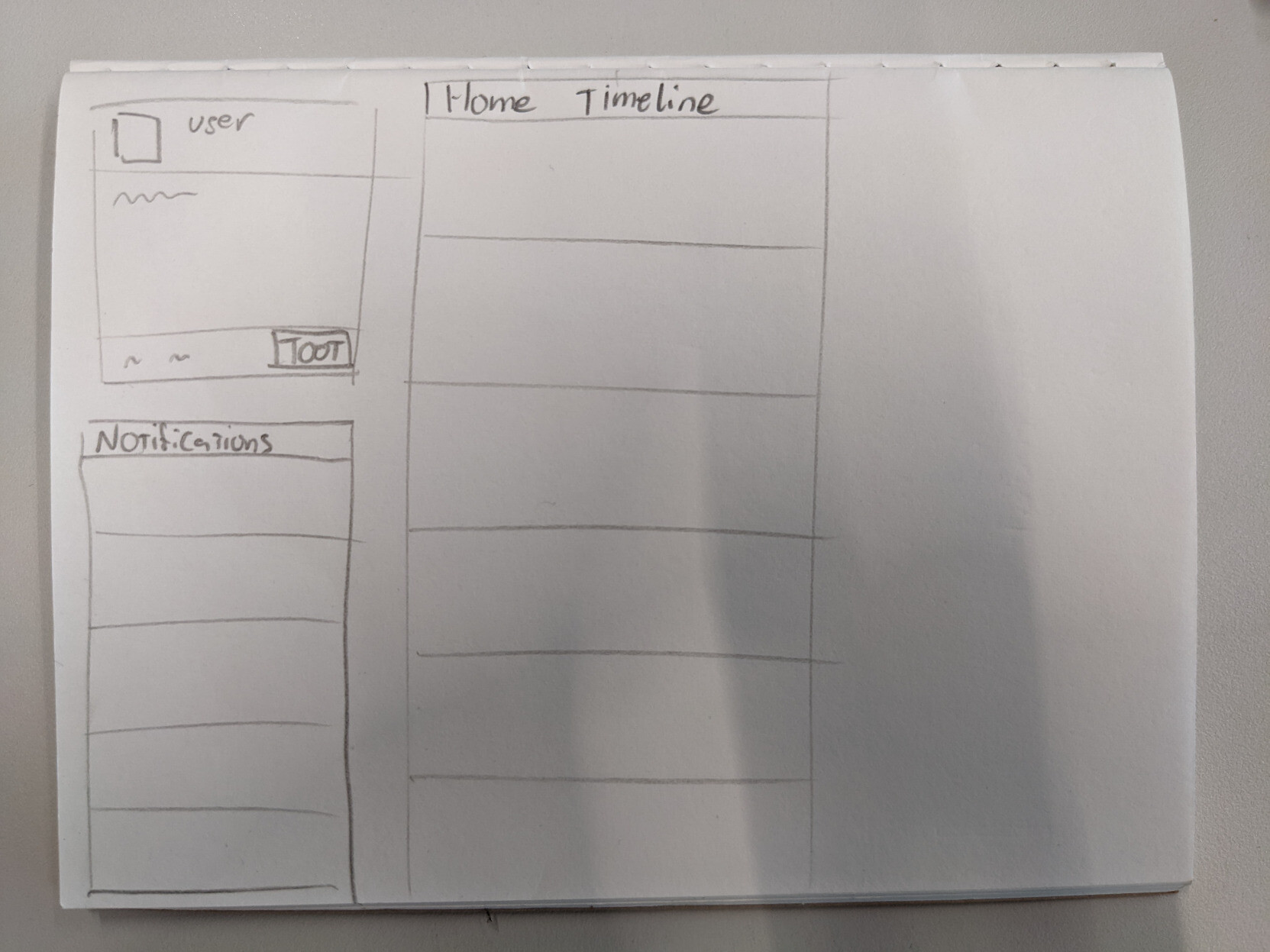
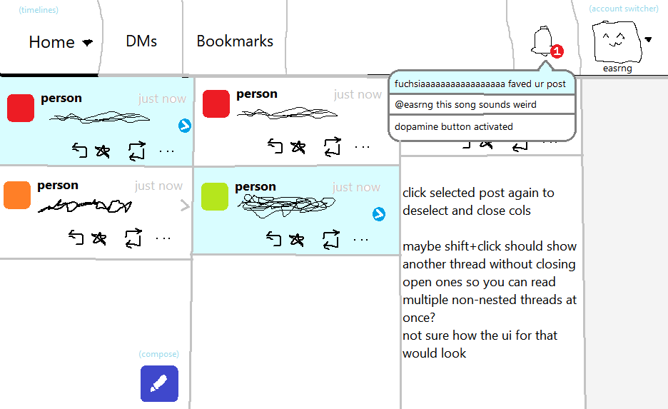
i wonder if there's a better way to marry the multi and single column layouts of mastodon, hmm
the empty right column would be used to display a focused toot/thread, or possibly a second timeline (local/federated). Notifications view will definitely be hideable/filterable too

Features I like
@f0x I like being able to remember recent searched terms or hashtags.
The standard TL filters are nice (like no boosts etc.). A quick button to show only mentions, without fiddling with the settings in notifications is also super convenient.
I'm sure I can think of more, but brain is zzz atm.
Features I like
@f0x oh , and I miss being able to favorite a hashtags,
that is something I've been thinking it for the Tusky ui. How it can be part of the ui for remembering search too.
So maybe a combination of recent searches and saved searches. 🤔
Because in Tusky it feels like a lot of wasted real-estate.

@f0x I use pinafore and I'm pretty happy with it, it can get a little slow if it loads more than a few hundred posts at once on my phone though. I have a fork and I added support for
choosing the post format [glitchsoc, pleroma]
properly rendering quote renotes [pleroma]
rendering most misskey flavored markdown (only math, sparkles, and search are missing i think) [akkoma]
@f0x i use the mastodon web multicolumn layout on desktop and brutaldon on my phone.
I like multicolumn because I can have multiple pieces of context on screen while I compose a reply (e.g. a post and another thread they refer to in that post).
On my phone the (nearly) static page nature of brutaldon seems to deal more nicely with unreliable connections than a constantly refreshing single page.
@Vierkantor hm bit confused about the second paragraph, would you have one toot visible in the home tl and the other in the right-most pop-out view column?
@f0x yup, exactly!

@f0x
I use the multi-column layout because it lets me look at multiple timelines and my notifications at the same time.

@gotosocial I like being able to create a thread of toots within the same compose window, being able to get rid of Emoji from usernames, and having image descriptions read out within thw toot, so I don't have to tab to it. I'd also love the ability to get rid of Emoji in both the username and toot text if I want, and have profiles where their toots are in a separate, updated list so I can follow them more closely, like the Nextcloud folks and other software updates like an RSS feed.
@f0x I think it might be interesting to have a layout like macos finder's multicolumn layout where you'd have your timeline first and clicking a post would open it in a new column to the right
@easrng isn't that pretty much what the mastodon advanced layout does? with posts opening in the rightmost sidebar
@f0x i haven't used it, i'll go check
@f0x kinda? it doesn't look like you can go deeper into a thread in a new column, also imo when you open a new column it should open directly adjacent to the column you're opening it from and not all the way to the right. I'll try to draw an example of what i was thinking of
@easrng thanks for the illustrative drawing :D
What I'm currently considering will have the "view thread" on the right hand side, so right to the timeline you clicked it from, https://social.pixie.town/@f0x/109200988444654088
But I don't think I'll implement going arbitrarily deep like that, for now at least

@f0x I am a multi-column guy, but that is because I also use TweetDeck and that layout makes my brain happy

@f0x i love and frequently use Metatext's (iOS) ability to fav/boost/reply from a different account than the one i'm currently using by long-pressing the relevant action
as for new features, Mastodon and Pleroma support a query param that filters boosts out of someone's timeline when viewing it, so you can see only original toots (because i asked for and implemented it) but only Mast (iOS) ever used this feature afaik

@f0x I joined when mastodon defaulted to multicolumn and I hadn't used Twitter (I was from Tumblr) so I have always been used to it. I appreciate being able to see both the timeline *and* a specific thread at the same time, like jumping out of a stream without losing your place in it.
I think single-column is just too wasteful of the screen economy on a desktop monitor, although part of that is the excessive padding and icon size that modern web design utilizes.

@f0x (For web/desktop)
I would like better keyboard accessibility.
On a web client, that would mean:
No overlapping targets; makes it hard to understand what will actually get activated, and hard to see what to type.
Don’t make me hover an image with a pointing device to see the description.
Don’t hide anything/show it only on hover in fact.
No clever custom widgets, use the standard ones.
Have disabled people as beta testers because we’ll always find something to improve. :)
No client that I know of does this right.
Pinafore is at least usable.
Mastodon is really hard to use in both simple and advanced mode.

@f0x the multi-column client is nearly impossible to operate using the keyboard due to focus issues. the single-column version is much more keyboard-friendly, but overall pinafore is faster and more accessible, so I've been using that since I discovered it many years ago.
pinafore is an absolute gem; it's fast even on old hardware, and I've never encountered a single bug in it. it's by far the best web application I've ever used; maybe the only SPA I would recommend without hesitation.

@f0x (this server might go down later as it's experimental, so if my reply is useful to you feel free to copy it somewhere)
in masto web i prefer single column because multicolumn is somewhat cluttered, and it doesn't really give me that much tools to interact with multiple threads at the same time, unlike pinafore and subway tooter. the trade-off on horizontal space with the advanced UI doesn't prove worthwhile for me.
with pinafore I really like I can open threads in other tabs and just interact with them from there. really nice that instead of the app handling multiple threads, we can just reuse the native tool the browser provides for this purpose.
some customisations i use are: disable animations, disable making the whole post clickable (i.e. only the timestamp is clickable), and disable autoloading / infinite scroll. i'll attach a screenshot of my prefs for reference.
it's also really nice that reply textboxes are in the context instead of popping up in a separate column. i can compose several replies simultaneously when need be. e.g. at times i need to leave a reply i'm composing be but another thing i could just reply turns out, and i can just send that without losing my other, more elaborate reply.
what i dislike about pinafore:
it's really bad at handling custom emojo
reliance on too much javascript and CSS variables for the UI which makes it harder to customise using Stylus and user scripts. it'd be nice if the client was amenable to user customisation this way
the way it handles media description entry is bad enough that for non-trivial stuff I use the masto web interface, or I need the image to be up on another window
i think it could use vertical space a bit more efficiently, e.g. moving author details and the permalink to the same column as the author avatar, instead of a vertical row atop the post text
pinafore doesn't know that you can self-boost followers-only posts
option to ask for confirmation before delete&redraft, follow/unfollow, block etc. would be welcome
pinafore doesn't know that mutes can have time limits
pinafore's reporting interface is sub par
it'd be nice if I could pin more stuff on the navigation bar (you can change the local tab to something else but that's it, I'd eg fancy to have both the local timeline and my bookmarks pinned)
i'd really like to get something like twitters thread composer where you write your thread as a series of posts and then post the whole thread at once
pinafore doesn't know specific features of gts, glitch-soc and hometown forks, it'd be nice if it did
respecting colour-scheme-preference would be good
one particular annoyance with pinafore is with most themes it's very hard to tell if a button is toggled because the colours of toggled and untoggled buttons are similar shades of the same colour; i use stylus to add borders to buttons that are toggled on (e.g. fav, boost).
this is all i can think of, hope it's useful

@f0x single column here because it's not too stimulating and i like the masto ui because i can take my wireless mouse with me and stretch out around my desk and scroll mostly passively. i have thumb buttons for back/fwd which help too
better filters and CWs would be great for me. on here i don't think my CW open state stays set consistently

@f0x Personally rather like the web UI's advanced interface for the most part. I looked at Pinafore but it was too minimalist with too much negative space for my tastes--and I would need a multi-column layout to be happy with it.
The most intriguing interface I've seen is the desktop app was Sengi, which I haven't actually tried, but the way it is set up seems to match my desires, so someday I may try it out.

@f0x Single column is preferred because I'm a Tumblr emigrant.
@f0x I'll be back with more thoughts after I'm back from gym
@f0x In addition I'm a huge fan of swappable color palletes. Other than that I tend to drift towards a more tumblr like ui

@f0x I prefer multi-column, because it lets me visibly keep my place in my stream while also looking at an individual post and its thread. If I were using single-column I'd probably do a lot more opening-things-in-tabs than I currently do.

@f0x I use the web client + single column mode (almost) exclusively. (single column because my phone is, yknow, a single column wide)
I'm not super thrilled about that, actually, because I frequently forget the local timeline exists and it's kind of important!
besides that my main problem is that I have all images spoilered (nice feature) and I like to re-hide the image when I'm done looking at it… which usually takes multiple tries to tap the eye icon? I'll end up maximizing the image instead
@f0x I prefer multi column on web. And the ability to easily switch between columns on phone.
I love the ability to change a setting though! But I'd like multi column to be default to show it as an option and have single one as an offer be part of the... Introduction... On boarding modal, which is very long in the future.
@maloki I'm wondering if just having a center column with the timeline, and one next to it for the selected thread isn't enough 'multi' columns for most people. Especially when notifications are also visible to the side
@f0x I mean, what if that's the basics, and then you can pin stuff as you go?
@maloki worth considering yeah
@f0x which is kind of similar to how how masto web does advanced.
@maloki true yeah. Idk, i've been using the advanced interface for ages but i'm starting to feel (or notice) it being to overwhelming for me. But the simple interface is lacking too much so.. looking for a good in-between model if possible
@f0x yeah, that makes sense.
Maybe we can ask the question, if you could combine your favorite features of single column and multi column interfaces of using Mastodon (so like include other apps like pinafore etc), what would you want?
Actually the more I thin about it, there's some stuff I wanted to talk with you in private about, and we can probably roll in the next natural part for me for this in the too.
Matrix?
I love brutaldon.
(brutaldon.org)
It is "minamalist" and it can run without javascript.
I'd look at it for an example of bare bones (:
It is absolutely NOT for everyone. (Though, I can't exactly figure out WHY, because it's ... just a great client that does what I want... like only show a few things at a time, and then, when I reach the bottom, I can decide if I want to continue or if I should go do something else... that sort of thing.)
I _would_ like it to reformat edits better, but I have the ability to fix that... one day. When I have time. Because I have commit access at the gitlab where it is (: But, for now, it's been working for me for... 4 years? or so?

@f0x I didn’t like how some clients defaults to seeing replies to anyone in the home timeline. I don’t want to see $followed reply to $notfollowed, especially since it’s generally void of any context. One of the two clients I tested doesn’t have an option not to show those replies.
I do not know if this is a common fediverse design pattern, as my experience is limited to two clients. I can guess it may be since it would increase participation in misc. discussions, and increase the community feeling, but I personally find it is noise.
It should be a choice to empower the user about what they prefer to see.
@f0x as a single-user instance user’s single user, I am self-centered and I think that me, and only me should be the center stage of that instance.
So, as “main interface” for an activitypub instance, I’d like to see things like the “known timeline” and other “multi-user-first” things be entirely removed from view by the public. But that’s only for software that’s intended to be the “main interface” for an activitypub instance. This shouldn’t apply for a purely client software.

Context: I'm starting on a new fediverse webclient, FediFox. It's starting point is having a more full-fledged client that's independent of server implementations (but mostly geared towards #GoToSocial).
I'm designing both for web (laptop/desktop) and mobile (PWA)