 fuchsiaaaaaaaaaaaaaaaaa
@f0x@pixie.town
fuchsiaaaaaaaaaaaaaaaaa
@f0x@pixie.town
- personal site
- https://cthu.lu
- freelancing
- (web)dev, ask :3
- matrix
- @f0x:pixie.town
- biometrics
- they/them, 24 sun revolutions, tall
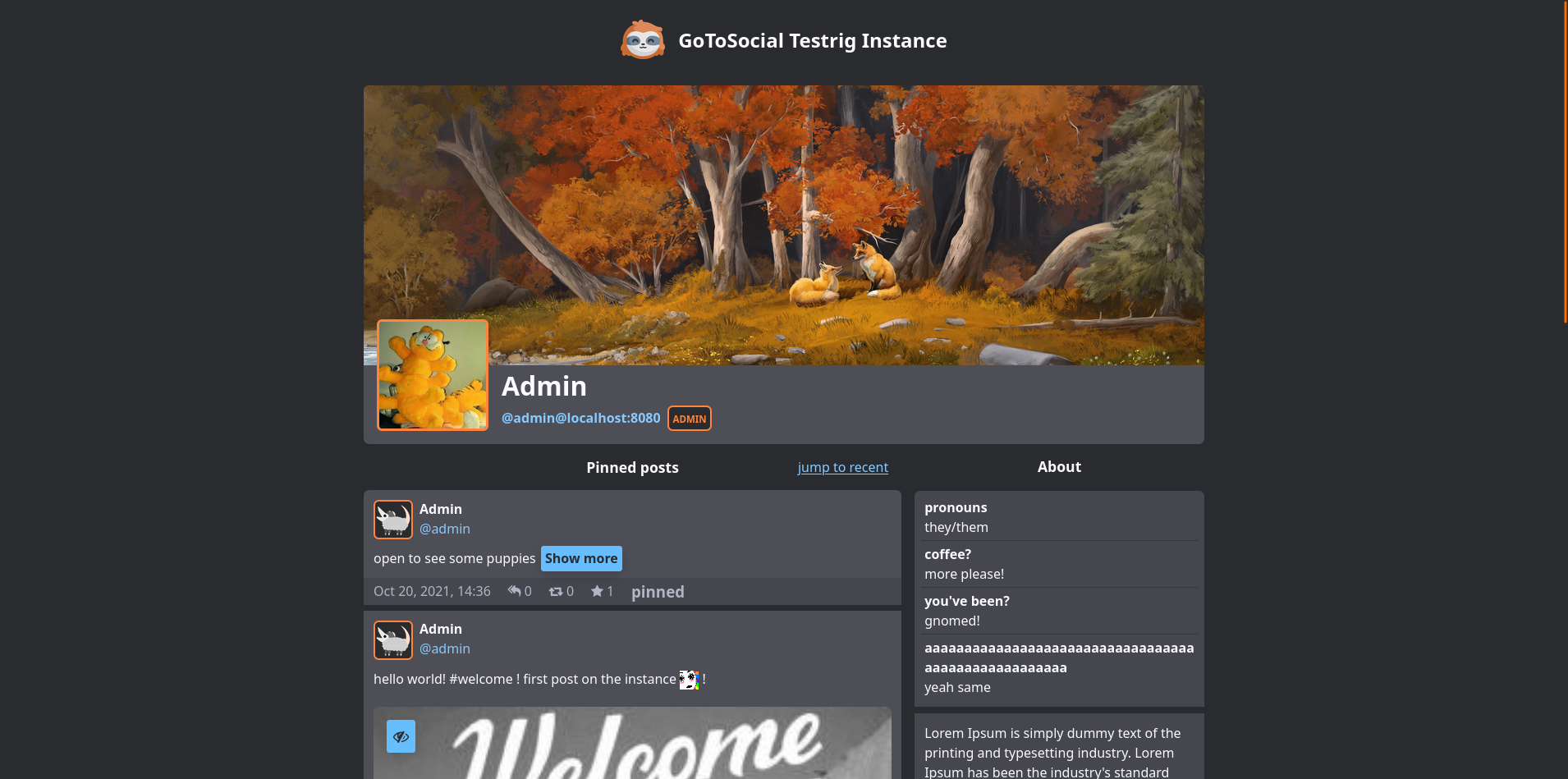
Admin
⚠️ READ BEFORE FOLLOWING ⚠️
if i don't know you from elsewhere (under same nick), shoot me an introductory DM first (following back is fine)
I do anarchist tech stuff and run free services at https://pixie.town
I program, solder rgb led thingies, and fly fpv quadcopters
en: they/them
nl: die/dies (langzaldieleven.nl)
“i don't trust like that”
not a furry, actually
Extreme coffee-out-of-a-wineglass Energy
something something trans list stop scraping bios
and now a word from our sponsors (screenreader warning it's zalgo)
T̀ͧ̓̑͐̓̍̂̏҉̴̷͚̦̤͙̜̖͙̝͟ợ̵͈̗̮̲̥͕̼̩̭̞̙͉̆ͮͧ̉̒́̑̍̋ͭ̌ͭ̒̉́̕͟ ̐̅̈́ͯ҉̸̴҉̹̟͕̖̠̟̤͕į̸̙̮͓̤̠̘̫̦̥̣̻͚̣̎ͭͯ̋̉͝n̔̄̏̈́̃̇͛̂̋̇̐́͘͝҉͙͔̠͇̖̤̹̭̱̪v̴̴̛̘̠̰̹͚̱͉̳̘̥̞̳̪͈ͥͭ̅ͥͦ̀͛̔̃̃̎͋̋̎͐͌ͪ̚͟͢ͅö́́̎ͬ̔͑̆̃̅̒̿ͪͯ̓͏̞̱̜͍̬̗̹̫̝̪͓͕̳̬̰͘͝kͥ̒ͣͦ̌͛̃͒̀̿ͣͪͤͬ̍ͮ̚̚̕͝҉̹̰̟̰̻̻͍̠̗̳̬̬̬̞̟̹̩͇́͜ẹ̴̡̨̱̹͍̯̱̗̗͍̬̐ͣ̑͑̐̓̈̑ͥ̅́̇̃͒̀̃̂́ ̨̛͖̬͇̣͔̼̥̬̝̥̣̭̝̪͎͈̌̅͆̉̀͘͜ͅẗ́̄͊̌̍̆́̿́̊ͣͮ̅ͥͩ̔̏͏̧̳͎̥͈ͅh̴̴͇̻ͧ̍̐̈͐̎͛́̀̽̃̒̔͢͢ȩ̸̶̶̟̗̮̺̭̥͕̭͎̺̙͎̖͔ͪ̑͛̓̅ͪ̄́ͧ͡ͅ ̡̧͇̤͚̻̬͉͔̥̫̟̙ͮͩ͌̿́̆͋͜h̵̨̭̰͎̭̱͊͒́͒͆̎ͮ̈́̆ͪͧ̚͞î̛̦̞͓͖̭͈̮͔̩͙̱̖̞̳̥̦̩ͭ̂̏͒ͨ̃̿̽̓͑ͫ̕͝͡vͧ͋ͪ̌̂̑́͌̂̒͑ͮ̋̂ͫ̈́҉̹͜͢ȩ̡̖̯̞̺̭̗͔͇̻̤̼͈̙̞͉͙̈ͤ͊ͨ̀̆͆͒̓̄̿ͭ̃̚͜͝͡-̶̪̪̠̝̜̯̜̹̭̯͎͍̲̱͉ͪ̏͒̊ͫ̀̈͘͡m̸̪̘͙̰͚̗̳͕̟̖̿̌͐̔̐̈̽̃ͯ̅͢ͅͅi̸̷̧̛͍̝̦̫̮̤̐͑͗̏ͬn̡̨͆ͩͤͫ̔̈́̈́͊͐̂͛̀̚͞҉̜͍̝̰̱͚̜̹̞̝̞͈d̢̫͕͚͕̥̰̝͆͗́ͨ͑̈́̓͜ ̡̩̜͎̳͎͂̓ͫͭ͐̀͡ȑ̷ͭ̑ͪͭ͋͢͏͕̳̟͜ͅͅe̴͌̅ͣ̾͒̔́̊̔ͭ̅̄̇͏͎͉͈̤̙p̀ͥ̈ͨͩ͛ͥͣ͗̄̈́̚҉̢͔͉͍̹̮͉̺r̵̸̡̩͎̱̟̺̟̞͈̯̯̪̹͂́ͣ̐͑̒̒̀ͧͩ̿ͮ̕͞ě̵̡̱͈̜̯̳͍̝̦̜̫͈̜̗̘̪̪̓͆͑͋ͮͯͪ̅̂͐̔̆̃ͫ͑̾͒͢ͅş̶͓͉͚̜̪̜͓̘̻̃̔ͨ́̀ͅẻ̵͇͈̮̝̠͖͍̫͉͓̪̠͔̬͕͛̊͐̎̓̽ͫ̌ͧ̅̿́͘n̛͚̺͈͍̰͉͙̤̘̺͖͉̤͖̈͑͑̍̅ͪ̎͂́ͦ̒ͣ̋̆̄̄̍̃̊͟t̵̛͙͚̥͇̫̻̞͖͕̰͈̩̰̱͉ͣ̃ͫ̋̍̈ͥ͗̎ͭ͋͜i̵̡̤͇̣̰̦̟̭̮̩̲͔̭̟̖̹̙ͥ̆̋ͫ̓͌̒̾̍̄̾̎̂͂̏̇ͩ̚͢n̶̮̹̤̻͈̙͔͎̦̟ͫ̀͌͛̋̌̽̀̓̂̕g̷̣͖̠̩͈̲̥͍̦̘̺̏̍͛͋̎͛͒ͪ̇ͮ͠͝ ͦ͂́̿͐̅̌̊̌̉̍̀҉҉͈͖̮̩͎̮̬͖c͖̬̠̫̠̫̗̉̾͋͒̏̄̈́ͬ̊̓͘͝h̴̷̨͉͖̱̗̪̣͕̮͓͕̺͖͈͙̥̬͓̟ͣ̏̀͐̀́̍ͪ̋͒͐ͪ͐́̕a͍͈͉͎̥̠͍͛ͭ͛̃ͫ͒͋́͟ö͙̻͔̙͖̰́̋̑́͜s̶̸̫̖̫͇̣̻̺̹͔ͧ͐̂̈́ͮ͋̌͠.̰̯̞͎̗̺̠͔̫͍̖ͮͦ̒̏̈̾ͭͧ̉͘͢͠
Joined May 2019
look at me tweaking screen reader intonation :p quite interesting how much a bit of visually hidden punctuation can help
also fucked up little detail I found while testing with TalkBack (android screenreader) is the Mastodon toot's info line goes "May 4th, middle dot, (the privacy icon, nothing is said), middle dot, 0 (link), middle dot, 0 (link), middle dot, 0 (link), middle dot, Open in web (link)
(at least on 3.5.3)
re: masto question
@thufie it's just a mute for everyone on the domain. fucking absurd they're even called blocks
test
contents

@rune shitposter supply & demand, maybe next year buddy

wii shop bossa nova cover has been playing in my ear for 30mins now: https://www.youtube.com/watch?v=37cE20pFwwQ
pixie.town has been invite-based with only the most quality posters for years now, where is all our FOMO-fuelled hype, and massive investments
@elilla oh your dad is Canadian? I know some ghosts from there!
she moby on my dick till I ishmael

"nature calls" i say, excusing myself to the bathroom only to receive the tragic announcement that they will be denying all my submissions going forward without so much as a cursory reading, and that, were I to try, I'd also have to submit said papers as evidence in court
@Dee huh, weird. they also added some odd threading indicator on mastodon.social
@lauraamalasunta@strangeobject.space summer is great for this because you have all these nice (partially) outdoor day festivals from like 2pm till evening
@weirdwriter Something else that should help here is the user info, bio, and toots all being wrapped in separate sections, so they are easier to navigate around as entire groups, if I understand correctly
@weirdwriter right! So when I posted those screenshot, the ordering would have been the header, avatar, display name and username, then the section with (pinned) toots, followed by the profile fields and bio. Which also matches how it's laid out visually, from top to bottom, and left to right.
I tried out moving the bio column to the left though, and visually people seem to prefer that as well, and that ordering also makes more sense for screen readers I think, like you mentioned.
My comment about discrepancies between DOM and visual ordering is also not an issue then, as they're moved to the left/start for both.
In the general sense, DOM elements are ordered from top to bottom, and if there's space, can go left to right before wrapping further down. But there are ways to radically change the visual order, through CSS and other attributes, which can cause confusion for people who use screen readers combined with visual perception, as now jumping to the next element does not match the expectation.
@weirdwriter I was thinking about that, yes! It would make sense, but from what I remember, having different DOM/visual ordering is discouraged for accessibility. Or are you suggesting to have it visually on the left too?
@AgathaSorceress linking my mess too in case anyone is interested https://git.pixie.town/f0x/nixos/src/branch/main/nodes/cosmos/services/glitch-soc
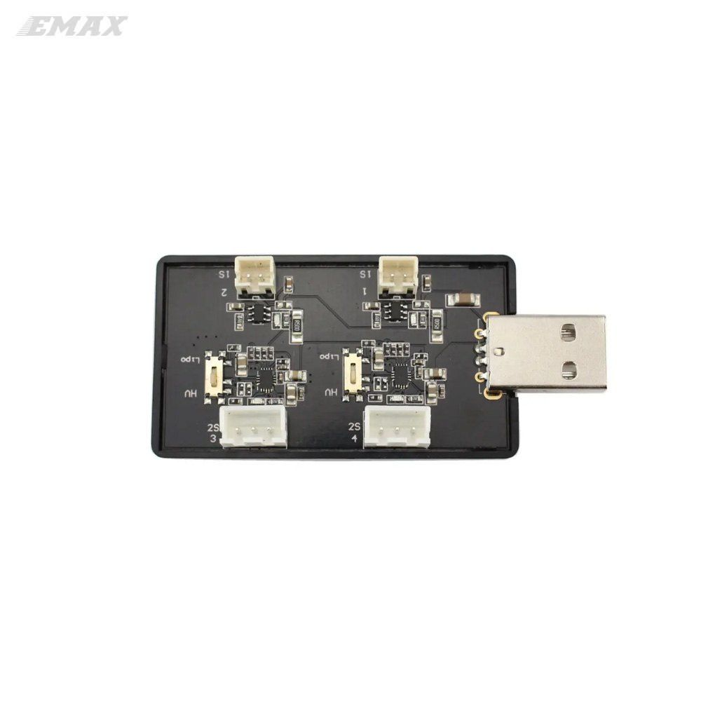
in other news im considering designing my own 2s quadcopter lipo charger 🤔 🤔
like this emax one is decent, but it only has 2 ports, and the other 2 ports are for 1s so i never use them. so a nice 4 port multi-charger with a similar design would be great, probably usb type-c too
@steph@toot.party have you heard of this little thing called "adhd"
- personal site
- https://cthu.lu
- freelancing
- (web)dev, ask :3
- matrix
- @f0x:pixie.town
- biometrics
- they/them, 24 sun revolutions, tall
Admin
⚠️ READ BEFORE FOLLOWING ⚠️
if i don't know you from elsewhere (under same nick), shoot me an introductory DM first (following back is fine)
I do anarchist tech stuff and run free services at https://pixie.town
I program, solder rgb led thingies, and fly fpv quadcopters
en: they/them
nl: die/dies (langzaldieleven.nl)
“i don't trust like that”
not a furry, actually
Extreme coffee-out-of-a-wineglass Energy
something something trans list stop scraping bios
and now a word from our sponsors (screenreader warning it's zalgo)
T̀ͧ̓̑͐̓̍̂̏҉̴̷͚̦̤͙̜̖͙̝͟ợ̵͈̗̮̲̥͕̼̩̭̞̙͉̆ͮͧ̉̒́̑̍̋ͭ̌ͭ̒̉́̕͟ ̐̅̈́ͯ҉̸̴҉̹̟͕̖̠̟̤͕į̸̙̮͓̤̠̘̫̦̥̣̻͚̣̎ͭͯ̋̉͝n̔̄̏̈́̃̇͛̂̋̇̐́͘͝҉͙͔̠͇̖̤̹̭̱̪v̴̴̛̘̠̰̹͚̱͉̳̘̥̞̳̪͈ͥͭ̅ͥͦ̀͛̔̃̃̎͋̋̎͐͌ͪ̚͟͢ͅö́́̎ͬ̔͑̆̃̅̒̿ͪͯ̓͏̞̱̜͍̬̗̹̫̝̪͓͕̳̬̰͘͝kͥ̒ͣͦ̌͛̃͒̀̿ͣͪͤͬ̍ͮ̚̚̕͝҉̹̰̟̰̻̻͍̠̗̳̬̬̬̞̟̹̩͇́͜ẹ̴̡̨̱̹͍̯̱̗̗͍̬̐ͣ̑͑̐̓̈̑ͥ̅́̇̃͒̀̃̂́ ̨̛͖̬͇̣͔̼̥̬̝̥̣̭̝̪͎͈̌̅͆̉̀͘͜ͅẗ́̄͊̌̍̆́̿́̊ͣͮ̅ͥͩ̔̏͏̧̳͎̥͈ͅh̴̴͇̻ͧ̍̐̈͐̎͛́̀̽̃̒̔͢͢ȩ̸̶̶̟̗̮̺̭̥͕̭͎̺̙͎̖͔ͪ̑͛̓̅ͪ̄́ͧ͡ͅ ̡̧͇̤͚̻̬͉͔̥̫̟̙ͮͩ͌̿́̆͋͜h̵̨̭̰͎̭̱͊͒́͒͆̎ͮ̈́̆ͪͧ̚͞î̛̦̞͓͖̭͈̮͔̩͙̱̖̞̳̥̦̩ͭ̂̏͒ͨ̃̿̽̓͑ͫ̕͝͡vͧ͋ͪ̌̂̑́͌̂̒͑ͮ̋̂ͫ̈́҉̹͜͢ȩ̡̖̯̞̺̭̗͔͇̻̤̼͈̙̞͉͙̈ͤ͊ͨ̀̆͆͒̓̄̿ͭ̃̚͜͝͡-̶̪̪̠̝̜̯̜̹̭̯͎͍̲̱͉ͪ̏͒̊ͫ̀̈͘͡m̸̪̘͙̰͚̗̳͕̟̖̿̌͐̔̐̈̽̃ͯ̅͢ͅͅi̸̷̧̛͍̝̦̫̮̤̐͑͗̏ͬn̡̨͆ͩͤͫ̔̈́̈́͊͐̂͛̀̚͞҉̜͍̝̰̱͚̜̹̞̝̞͈d̢̫͕͚͕̥̰̝͆͗́ͨ͑̈́̓͜ ̡̩̜͎̳͎͂̓ͫͭ͐̀͡ȑ̷ͭ̑ͪͭ͋͢͏͕̳̟͜ͅͅe̴͌̅ͣ̾͒̔́̊̔ͭ̅̄̇͏͎͉͈̤̙p̀ͥ̈ͨͩ͛ͥͣ͗̄̈́̚҉̢͔͉͍̹̮͉̺r̵̸̡̩͎̱̟̺̟̞͈̯̯̪̹͂́ͣ̐͑̒̒̀ͧͩ̿ͮ̕͞ě̵̡̱͈̜̯̳͍̝̦̜̫͈̜̗̘̪̪̓͆͑͋ͮͯͪ̅̂͐̔̆̃ͫ͑̾͒͢ͅş̶͓͉͚̜̪̜͓̘̻̃̔ͨ́̀ͅẻ̵͇͈̮̝̠͖͍̫͉͓̪̠͔̬͕͛̊͐̎̓̽ͫ̌ͧ̅̿́͘n̛͚̺͈͍̰͉͙̤̘̺͖͉̤͖̈͑͑̍̅ͪ̎͂́ͦ̒ͣ̋̆̄̄̍̃̊͟t̵̛͙͚̥͇̫̻̞͖͕̰͈̩̰̱͉ͣ̃ͫ̋̍̈ͥ͗̎ͭ͋͜i̵̡̤͇̣̰̦̟̭̮̩̲͔̭̟̖̹̙ͥ̆̋ͫ̓͌̒̾̍̄̾̎̂͂̏̇ͩ̚͢n̶̮̹̤̻͈̙͔͎̦̟ͫ̀͌͛̋̌̽̀̓̂̕g̷̣͖̠̩͈̲̥͍̦̘̺̏̍͛͋̎͛͒ͪ̇ͮ͠͝ ͦ͂́̿͐̅̌̊̌̉̍̀҉҉͈͖̮̩͎̮̬͖c͖̬̠̫̠̫̗̉̾͋͒̏̄̈́ͬ̊̓͘͝h̴̷̨͉͖̱̗̪̣͕̮͓͕̺͖͈͙̥̬͓̟ͣ̏̀͐̀́̍ͪ̋͒͐ͪ͐́̕a͍͈͉͎̥̠͍͛ͭ͛̃ͫ͒͋́͟ö͙̻͔̙͖̰́̋̑́͜s̶̸̫̖̫͇̣̻̺̹͔ͧ͐̂̈́ͮ͋̌͠.̰̯̞͎̗̺̠͔̫͍̖ͮͦ̒̏̈̾ͭͧ̉͘͢͠
Joined May 2019