
menus in titlebar: a warning to heretics
The UI sins of Canonical's Unity Desktop Environment are being revivified and I just gotta state for the record:
Get your goddamn menu out of my titlebar. This shit is opt-in for the FREAKS out there. Y'all enjoy yourselves, but drop any aspirations of making your gimmick mainstream, please. Out, over there with the tiling wm freaks (affectionate).
Re: menus in titlebar: a warning to heretics
@thufie okay as in non-shitpost: you prefer macOS style menus where they stay at the top of the screen as opposed to Windows-style where they are at the top of a window?
Menus in titlebar: a warning to heretics
@Byte
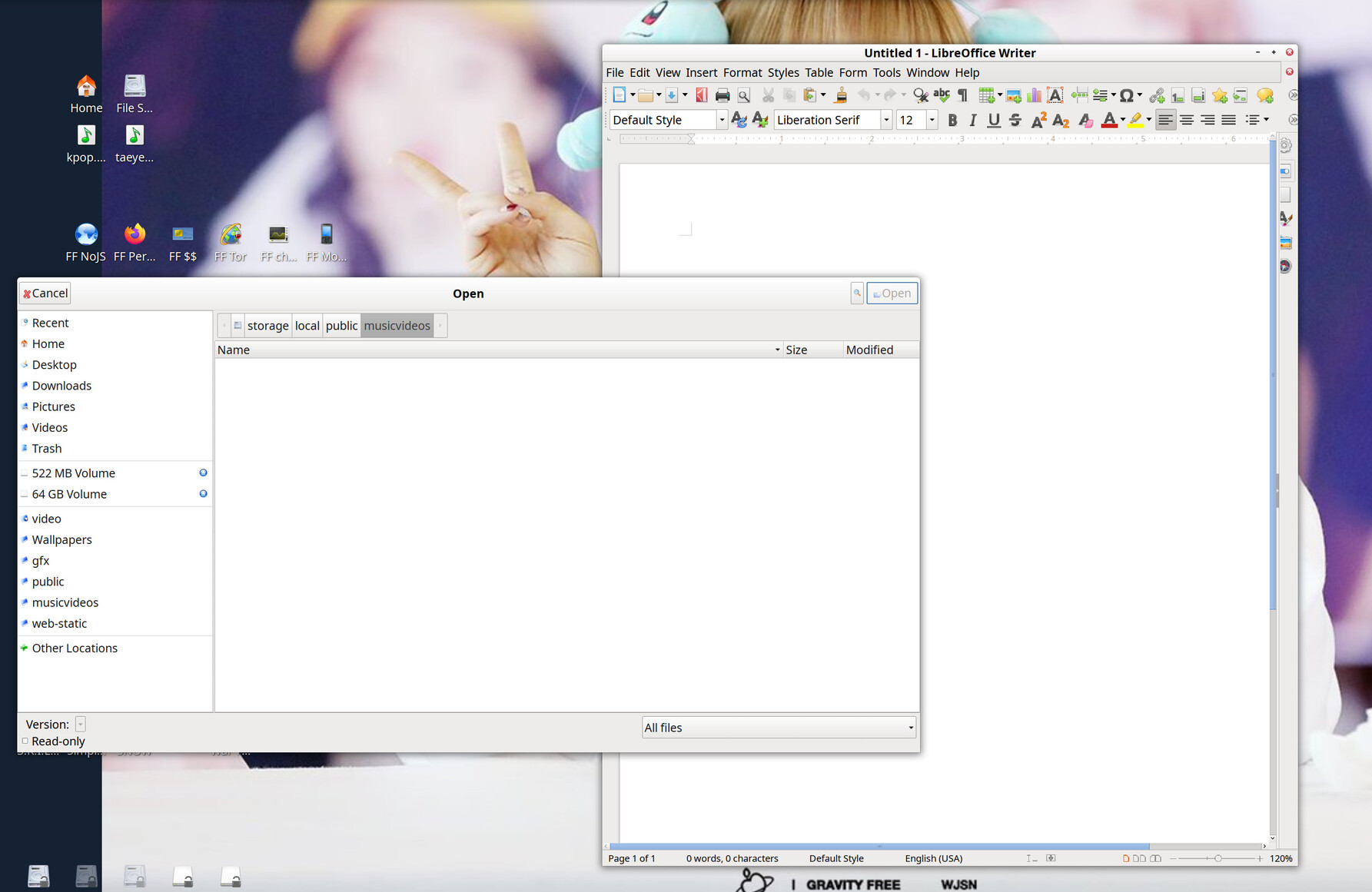
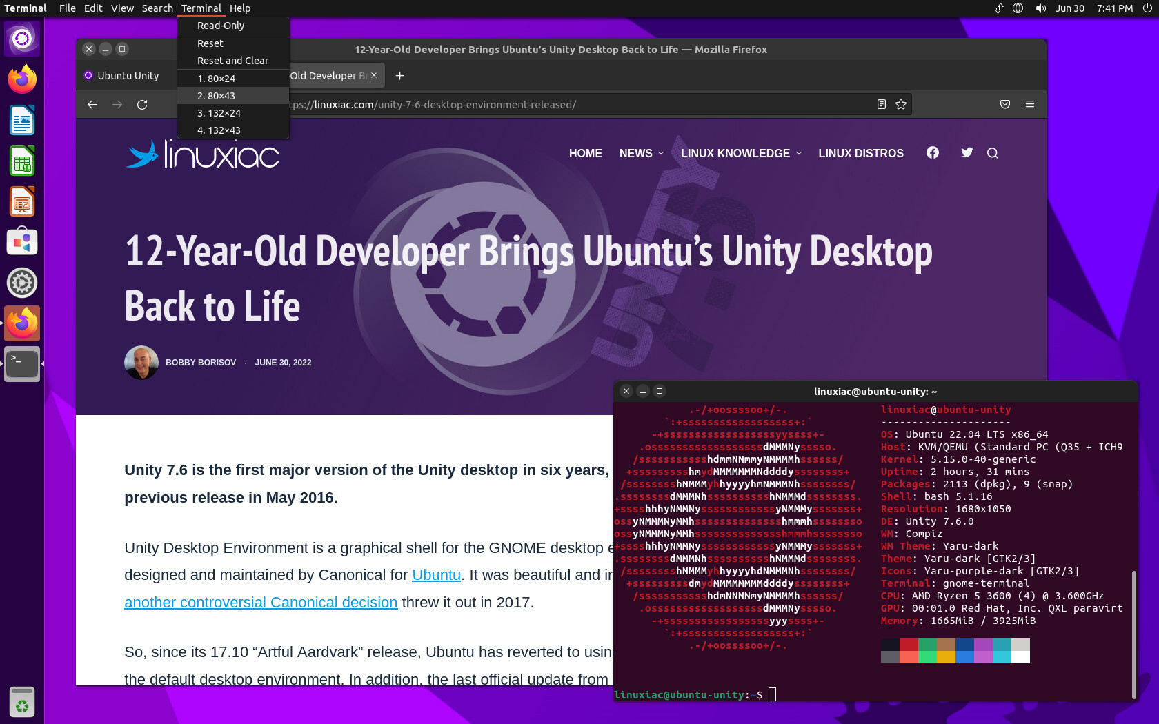
The menubar is the UI strip that usually has stuff like "File, Edit, View, Search, etc".
The titlebar is the bar on top of a window. It contains things like the title of a window, an icon for the application, some buttons for maximize, minimize, close, and it is usually a drag handle for moving the window.
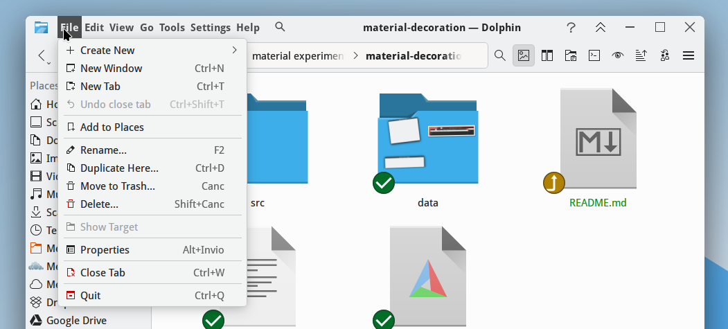
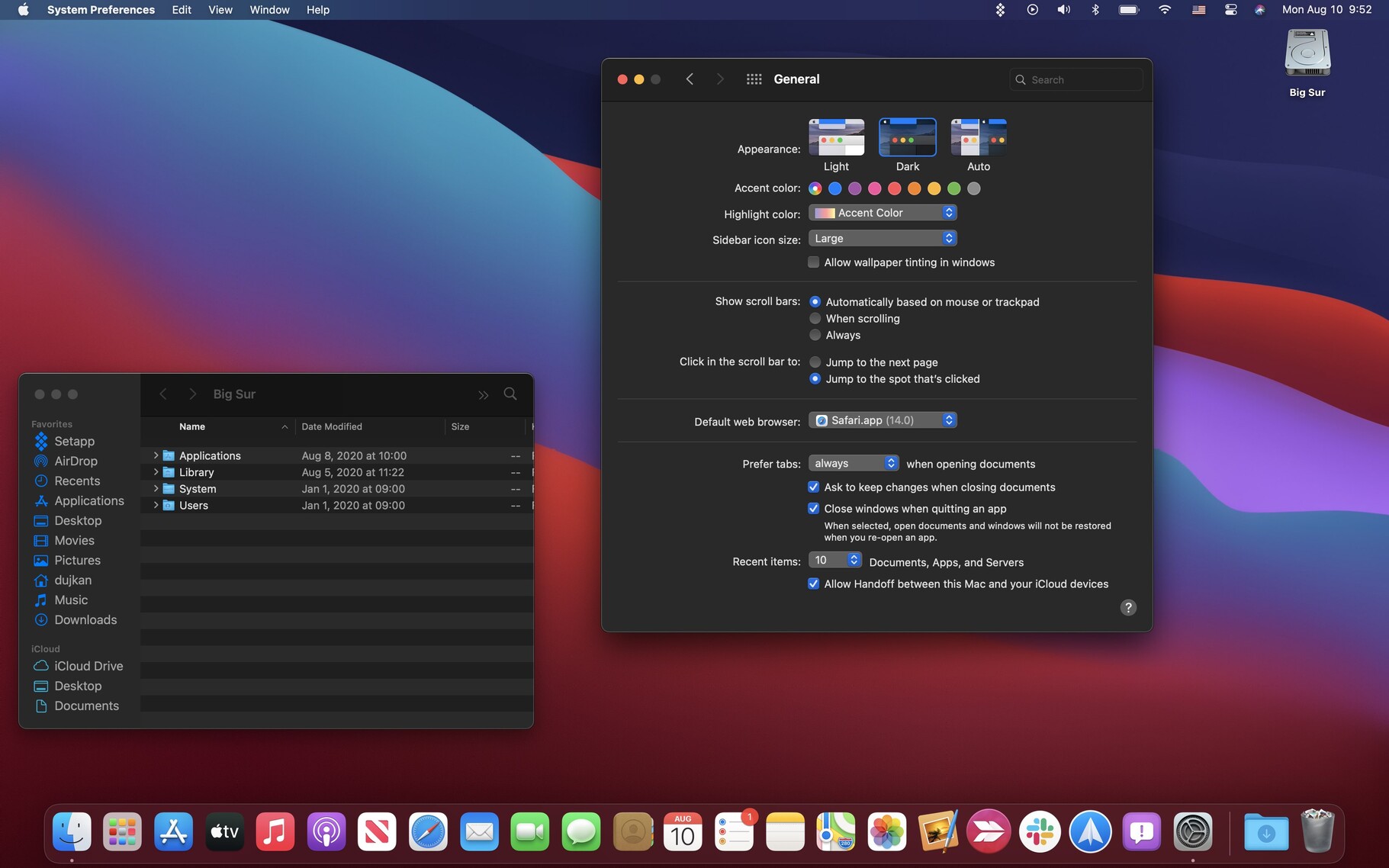
Most people never see these in an unorthodox confuguration unless they are a Mac user or have used Unity Desktop (both of these have a unified menubar at the top of the screen. Some absolute freaks go further, like in GNOME, where GNOME apps have a weirdly abbreviated/stunted menubar shoved in with the titlebar (usually just a single stupid hamburger menu button). This post was triggered by seeing a KDE extension to do the same thing. Unhinged. I don't want to accidentally click menus when dragging a window.
Here is the sacred inviolable rule which the various heresies will attempt to forsake:
All windows have a titlebar at their top. You can use it for moving the window and using window management operations. Below the titlebar, optionally (Or hidden until you hold Alt), is a menubar, which has a catalog of every function of the application in a ribbon across the screen which expand into submenus. In my opinion, anything other than a Titlebar atop a menu bar, per window, not in a tiling window manager, is infuriating unintuitive contrarian UI-design. It should be banished into the hills. The only screenshot below which conforms to this is xfce4, but this is also a traditional Windows desktop UI design.
I will include some screenshots with image descriptions for clarification. Heresies on display to be named and shamed: