Follow
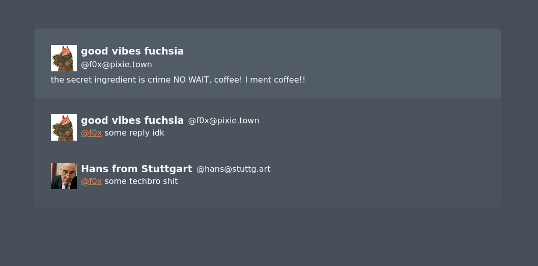
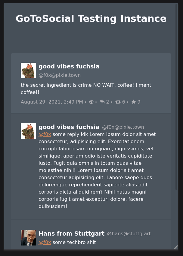
#GoToSocial webview test thread deployed!
https://gts-thread.dev.cthu.lu/
please give feedback, especially #accessibility feedback :)
the username + info box darker grey has a non-ideal contrast ratio (3.16), but otoh that's kind of the point because they're supposed to be less focussed?

also there's a slightly hacky overlay link tag so the whole toot is clickable, in the real template that would open that toot as the main focus instead